The Data Quality Dashboard allows you to quickly cycle through your carriers to see which ones are associated with large numbers of 'suspect' parcels.
Note
'Suspect' parcels include those where the carrier collects and processes the consignment before the advice has been manifested, incorrect data tracking scans, and general exceptions and failures.
The dashboard summarises the in-depth analyses provided by the Scan Latency Analysis report and Carrier Scan Completeness report.
Each measure for an individual carrier or carrier service is broken down by issue type, with the individual volume for each type being displayed on a line graph.
The report allows you to:
Identify which carriers have unacceptably high volumes of 'suspect' parcels, and which are the common issue types.
Escalate the carrier issues to eCommerce Analysts, making them aware that other Delivery Intelligence reports (e.g. the Carrier Review and Live Status report) cannot be relied upon until the issues are resolved.
The report uses the last 50 days of transactional data but there is no built-in drill through capability.
The Live Status report shows that many parcels in a selected trade lane are remaining at the In Transit status for too long a period. You suspect that a particular carrier is using a faulty tracking gun for one of its services.
To verify this, you would select the carrier service on the Data Quality Dashboard and then use Keep Only to show only that service. You would then select the Inconsistent Events graph.
You might then hover over the graph selector display the mouseover View Data option:
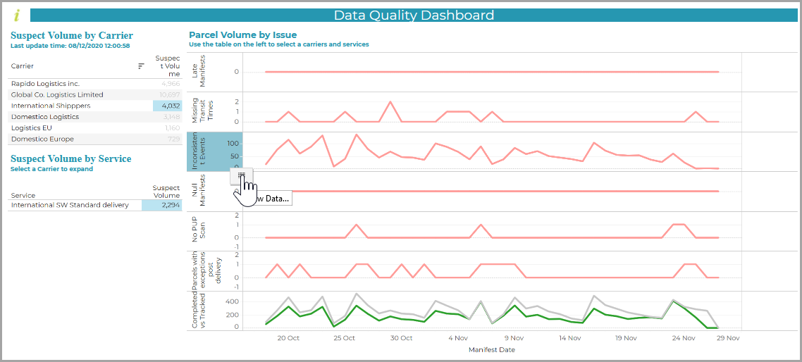
Once you select the option, the View Data window gives a clear breakdown of the data by date. It can be downloaded as a CSV file:
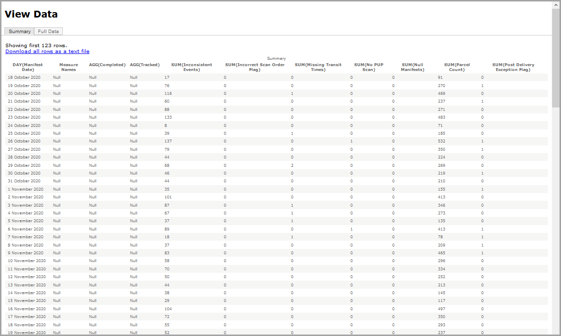
It can be seen that the number of Inconsistent Events is an unacceptably high percentage of the Parcel Count. This allows you to quantify your findings to the relevant carrier.
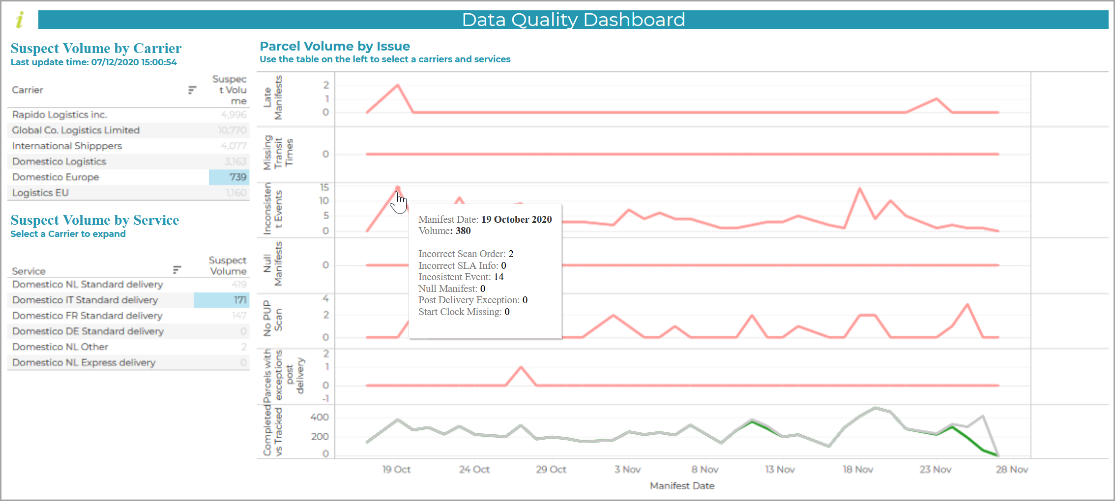
The default report shows the volumes of 'suspect' parcels broken down by issue type:
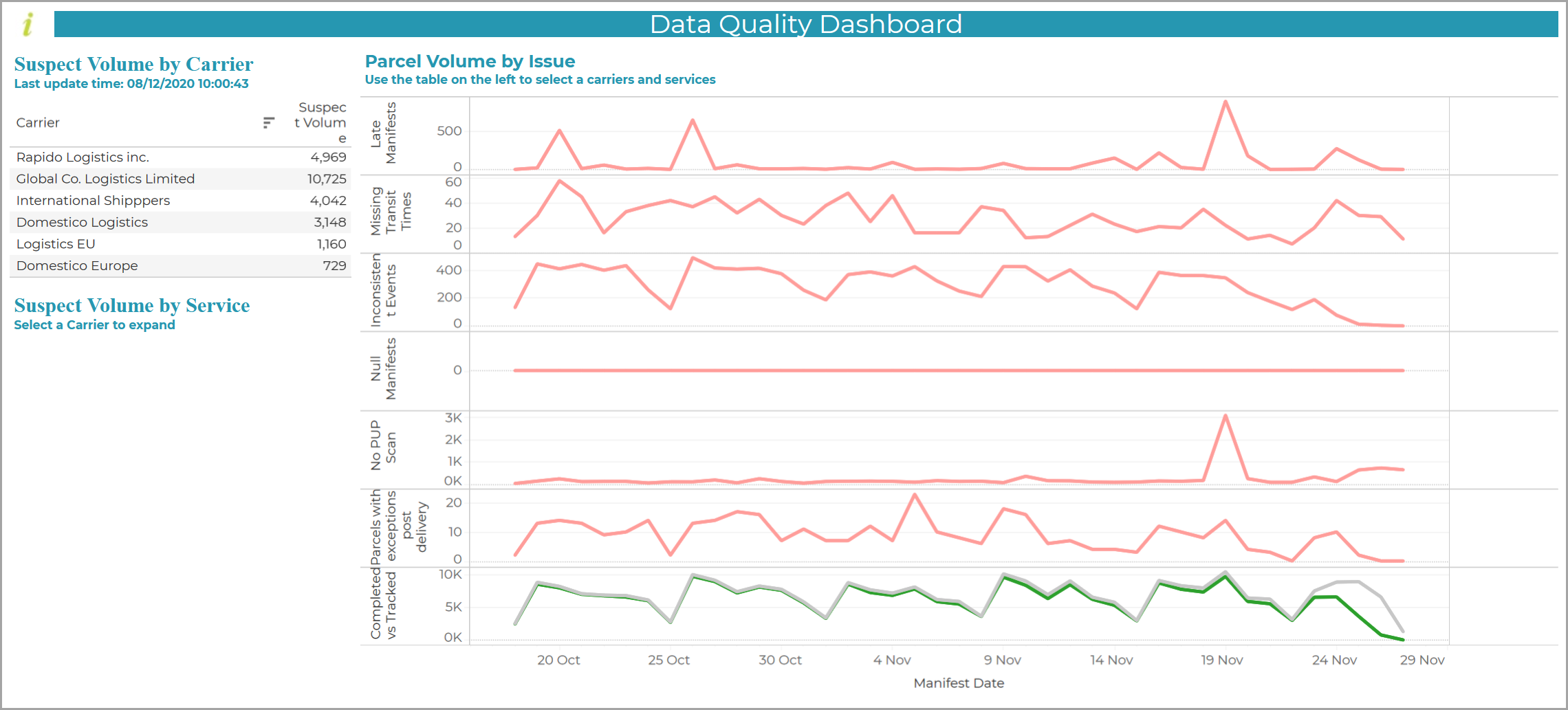
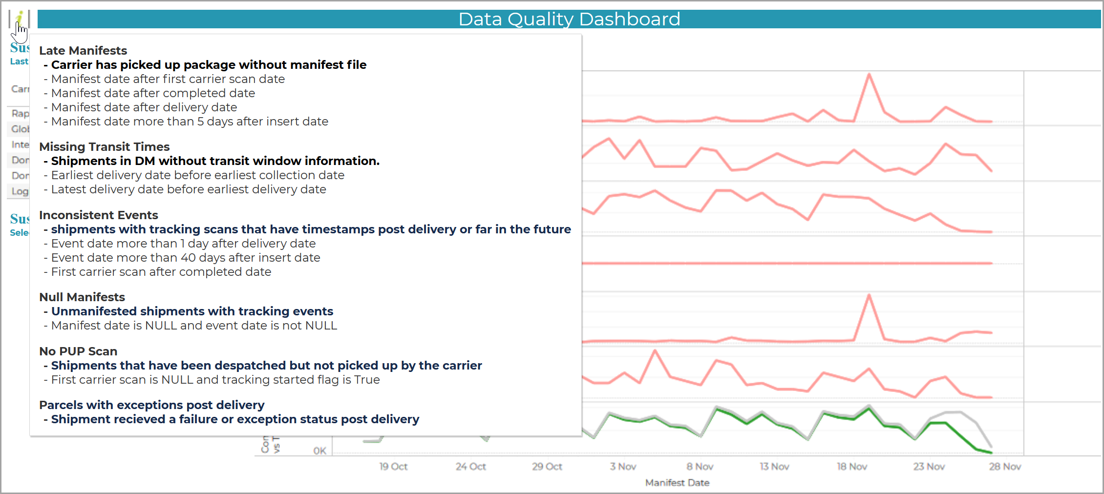
Each red line graph relates to an issue type. When you hover over the information button in the top left hand corner of the report, the definition of each issue type is defined in the help window:
When you select an individual carrier or carrier service, the dataset and line graphs are filtered automatically so that they only relate to your selection.
When you hover over any date on a line graph, the overall summary of the issues for that date for the selected carrier or service are displayed, e.g.
Note
If you wish to view the data in a grid as opposed to a line graph, then click the graph title, and hover over it until you see the grid symbol:
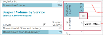
Once you click on the symbol, the data is opened in a new window (refer to Example).
Issue Types
A red line graph is displayed for each of the following issue types:
-
Late Manifests
The carrier has collected and defaulted the consignment to a carrier service in advance of receiving the electronic manifest. This means that the manifest date can be later than that of the first carrier scan, or even that of the actual delivery.
-
Inconsistent Events
Despatched consignments for which tracking has started, but to which, during scanning, carrier tracking guns have assigned pre-despatch or future timestamps. Such events will skew your latency, exception and performance reports.
-
Null Manifests
Unmanifested consignments with tracking events.
-
No PUP Scan
Despatched consignments for which tracking has started, but which were not scanned for pickup.
Note
Such events are referred to in the mouseover screenshot shown above as consignments where a 'start the clock' event is missing.
-
Parcels with exceptions post-delivery
Consignments with a failure or exception status following a 'stop the clock' event. This can indicate fraudulent behavior by the carrier, e.g. marking parcels as delivered earlier than the committed delivery window and then putting them back into transit or into an exception status.
Note
'Stop the clock' events are those that signify tracking as 'completed', e.g.
Address Query, Attempted Delivery, Cancelled, Collected From Pickup Point, Customer Identification Failed, Delivered, Delivered per Special Instructions / Safe Place, Delivered to Different Address, Delivered to Pickup Point, Delivery Refused, No Access to Destination Address, Out For Delivery, Partial Delivery, Recipient Carded, Refused by Recipient, Return to Sender.
Refer also to Carrier Scan Completeness report.
The final line graph show you the number of tracked parcels (in grey) as compared with those that were actually completed (in green).
This is a simplified version of the graph shown in the Carrier Scan Completeness report. However, the graphs in the Data Quality Dashboard are based on the manifest date as opposed to the guaranteed delivery date.
Based on the convergence of the lines, the graph is intended to provide an instant snapshot of how complete the tracking data is for the particular carrier. You can then go to the Carrier Scan Completeness report for a more detailed analysis.
The Data Quality Dashboard graph uses the following definitions:
-
Completed
The number of parcels that that are no longer in transit and have had a 'stop the clock' event.
-
Tracked
The number of parcels for which at least one tracking scan has been received from the carrier.